A dynamic dashboard interface displaying real-time insights.
Discover how complex data can be transformed into actionable knowledge with dashboards designed for modern finance and analytics teams
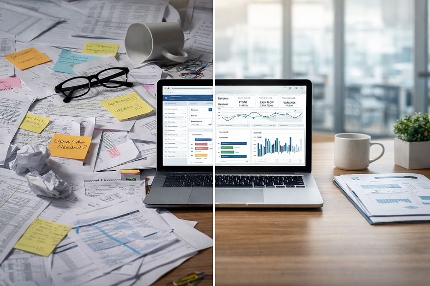
From Data Chaos to Clarity: The Need for Modern Dashboards
In today’s enterprise world, finance and analytics professionals face an overwhelming flood of data from spreadsheets, legacy BI tools, and siloed systems. Numbers pile up, but clarity is often missing. That’s where the journey of building a modern dashboard begins — bringing order to chaos.
I’ve seen situations where reporting delays, missed forecasts, or a lack of trust in numbers created serious challenges. The solution was clear: unlock real-time insights to enable smarter decisions. A well-designed dashboard is more than a reporting tool — it’s a strategic asset that turns raw data into clarity, helping leaders spot risks, identify trends, and seize opportunities.
Understanding the Vision: Aligning Dashboard Design with Business Goals
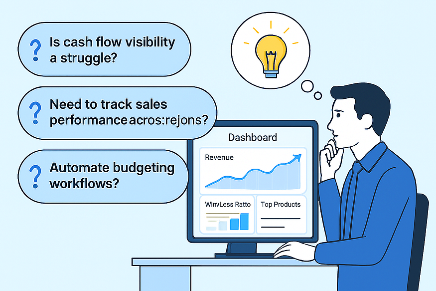
Every dashboard starts with a story — not with charts or KPIs, but with discovery. The first step is understanding the unique business challenges: Is cash flow visibility a struggle? Is there a need to track sales performance across regions? Or perhaps the goal is to automate budgeting workflows?
The real magic happens when design is aligned directly with these goals. For instance, a dashboard focused on sales performance might highlight revenue trends, win/loss ratios, and top-performing products. But more importantly, it should answer the question: “What action should I take next?” By focusing on business outcomes rather than data for data’s sake, every visual and KPI serves a clear purpose.
Behind the Screens: Integrating Advanced Analytics and Automation
Building a dashboard isn’t just about making it look good — it’s about engineering intelligence. Tools like IBM Planning Analytics (TM1), Power BI, and automation platforms can be leveraged to create dashboards that don’t just report the past, but also predict the future.
Machine learning models can be integrated for predictive forecasting, data refreshes can be automated, and seamless connectivity with ERP and CRM systems ensures smooth workflows. For example, I once worked on an automated sales dashboard that pulled real-time feeds from multiple sources, flagged outliers, and triggered alerts when KPIs crossed thresholds. What used to take a week of manual reporting turned into an instant, self-service experience.
User-Centric Design: Dashboards Built for Finance and Analytics Teams
A dashboard is only as powerful as the people who use it. That’s why user-centric design is critical — prioritizing the needs of finance, FP&A, and analytics professionals. Mapping user journeys, gathering feedback on wireframes, and iterating visuals ensures maximum clarity and actionability.
For finance teams, KPIs like EBITDA, cash flow forecasts, and budget variance should be front and center. Analytics teams benefit from drill-down capabilities, interactive filters, and scenario modeling. Best practices in visualization — bullet charts for performance, waterfall charts for variance, and heatmaps for risk assessment — help users move seamlessly from insight to action.

Delivering Impact: Real-World Outcomes and Lessons Learned
The story doesn’t end when the dashboard goes live. Success is measured by the impact it delivers. For example, after deploying a sales performance dashboard in the energy sector, leadership reduced decision-making time by 60% and uncovered $3M in at-risk revenue within the first quarter.
Key lessons I’ve learned:
-
Involve business users early.
-
Design for clarity, not complexity.
-
Automate wherever possible.
The best dashboards don’t just look good — they drive action and solve real business problems. By transforming fragmented data into a unified, interactive command centre, finance and analytics teams can lead with confidence.


Leave a comment