What is it?
Box plots have been around in PAW since version 2.0.63. The purpose of this visualization is to help the financial analysts to view the concentration or distribution of their financial data at a glance, including the summarized statistical information without requiring any sort of data science expertise or delving into the technicalities of writing complex statistical calculations to get this visualization.
The benefit of this visualization is that it is quite simple to create, no statistical coding is required with PAW doing all the heavy lifting while the users simply ensure the layout or position of dimensions is correct.
Illustration using sample data
Below is the sample data set used to illustrate how the Box Plot visualization is displayed in PAW.
Output
The data labels are manually added to the image to illustrate different components in the visualization and their corresponding values. These are not included in actual visualization.
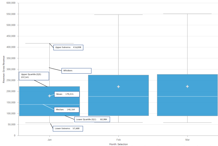
The visualization shows the following categories of information, also known as five-number summary
-
Minimum
-
Median
-
Quartile 1
-
Quartile 3
-
Maximum
of distributions on one graph, and also includes the outliers to cover all bases.
Technical deep-dive
Let's do a technical deep dive into understanding this visualization.
The minimum value (indicated as Lower Extreme in the image) is the least gross revenue of all the products we have in our sample dataset.
Second, we have maximum value, which is the opposite of minimum value (indicated as Upper Extreme) showing the maximum gross revenue.
These 2 sets of information are indicated by the horizontal lines at the endpoints of the box plot.
The vertical line that you see is called “whiskers” and these extend from the ends of the box to the smallest and largest data values.
Then onto number three, we have the median, and this shows the average or means of the middle two numbers of your data set with one half on the lower section and the other on the upper section.
Below is the Gross Revenue data of all the products for Jan, taken from the sample dataset, sorted in ascending order. The median in the below data set is the average of the middle two values highlighted in blue color.
57,600
82,984
1,05,299
1,75,029
1,05,228
2,37,541
4,16,838
Mean is the average value of the data and this is indicated by the plus sign on the box plot.
Number 4, we have the first quartile. This marks one end of one side of the box. The first Quartile is the middle number of the data points to the lower side of the median.
Number 5, we have the third quartile and this marks the other end of the box and this is the middle number of the data points to the upper side of the median.
Conclusion
So to wrap up, we have seen how Box Plots in PAW can be used to generate a statistical graph that has been precalculated. The one major downside and major critique I have for this are that, unlike other visualizations, it does not show value labels on the chart so it's really difficult for normal users to make much sense of this graph just by looking at the graph and I feel this is a very important feature set to be added for this visualization to be usable by non-technical users who by the way are the primary consumers of this interface and if this could be added then there would be much larger user adoption of this extremely useful visualization.


Leave a comment