<img src="https://trc.taboola.com/1278851/log/3/unip?en=page_view" width="0" height="0" style="display:none">
finding octane
Content_Cut_Icon Twitter_Brands_Icon

Drill Down Using Slicer in Power BI

Mode_Comment_Icon_white5
Alarm_Icon_1_white4 min

This article shows how to drill down to the next level in a visualization within Microsoft Power BI, when a filter is applied using a Slicer. This could be applied even if multiple selections are made within the slicer. For example – We have a car with 3 model series (L Series, S Series, T Series) in the slicer. Business requires to show the values at this level when no selection is made. Once a ...

down-arrow-blue
Book_Open_Solid_Icon


PA   powerbi-1 (1)

This article shows how to drill down to the next level in a visualization within Microsoft Power BI, when a filter is applied using a Slicer.

This could be applied even if multiple selections are made within the slicer.

For example – We have a car with 3 model series (L Series, S Series, T Series) in the slicer. Business requires to show the values at this level when no selection is made. Once a selection is made, the visual should show the next level in the hierarchy.

Visualisation without any filter selected (Shows the top level):


G1-1


Visualisation with single filter selected (Shows the next level for S Series):


G2-1
 

Visualisation with multiple filters selected (Shows the next level for S Series & T Series):


G3-1


In order to achieve the above in Power BI, follow the below steps,

Step 1: We have a ‘Model’ hierarchy setup in Power BI. The hierarchy was imported in Power BI using Octane connector from TM1. You could use any other hierarchy setup.

Lowest level is ‘model’ column with unique model names.


G4-1


Step 2: Create another table ‘Model Levels’ (used in this example) with 3columns from the above hierarchy in Step 1; 1st column being the Parent 2 & Parent 1; 2nd Column if Parent 2 then value is ‘L2’ else ‘L1’; and 3rd column being the lowest level model names.


G5-1


Step 3: Create a relationship between ‘Model’ & ‘Model Levels’ table with the lowest level model names. Select ‘Both’ in Cross Filter direction while creating the relationship.


G6
 
G7-1


Step 4: Create a measure ‘Sales_By_Model’ which calculates the actual value depending on the filter selections. If its selected, It drills to the next level, else, shows the top level.


G8-1


Step 5: Create a slicer using Parent 2 from the original ‘Model’ hierarchy table.


G9-1


Step 6: Create a visualisation using the Model Name (Parent 2 or Parent 1) from ‘Model Levels’ table created in Step 2 and for values, use the measure created in Step 4.


G10-1


New call-to-action

Leave a comment

Line

Power BI: What's new in PowerBI's August update on reporting?

Mode_Comment_Icon_black0
Alarm_Icon_13 min

In the ever-evolving world of data visualization and reporting, Power BI continues to shine as a leading tool, constantly enhancing its capabilities. The August update brings a slew of exciting features, focusing on making your reporting experience smoother, more precise, and more efficient than ever before. Let's dive into the game-changing updates:

PowerBi (2)

1. New Layout Switcher

Tired of the hassle of switching between web and mobile layouts while developing your reports? Say hello to the new layout switcher! Power BI has introduced intuitive buttons, thoughtfully positioned at the bottom of your screen, right alongside the page navigator. This means you can effortlessly transition between different layouts during your report development journey. It's all about streamlining your workflow and enhancing your productivity.

layout switcher (2)

2. Bubble Range Scaling Setting

For the detail-oriented report creators among us, this feature is a dream come true. The new bubble range scaling setting gives you the power to finely calibrate how bubble (marker) sizes represent your data, offering unparalleled precision and customization. Here are the three fantastic options at your disposal:

  • Magnitude: Bubble sizes closely mirror data proportions.
  • Data-Range: Bubble size boundaries align with data minimum and maximum values.
  • Auto (default): Automatically selects the best option based on your data's properties.

Customizing this setting is a breeze. You'll find it in the formatting panel under Markers > Shape > Range scaling for scatter charts or Bubbles > Size > Range scaling for maps. Your reports, your way!

New bubble range scaling setting

3. On-Object Interaction

Efficiency meets aesthetics with the on-object interaction upgrade. Now, you can horizontally resize on-object menus, a game-changer, especially for developers dealing with lengthy field names. But that's not all – Power BI has taken it up a notch by optimizing the positioning of these menus to maximize canvas space usage. As a result, the on-object menu gracefully ascends and expands into the canvas area, ensuring the visibility of field wells without the need for tedious scrolling. It's all about intuitive design that puts your data in the spotlight.

on object interaction

The August update for Power BI is a testament to its commitment to empowering users. These enhancements promise a reporting experience that's smoother, more precise, and visually stunning. If you're ready to elevate your reporting game, now's the time to explore the incredible features of the Power BI August update. Your data storytelling journey just got a whole lot more exciting!


Line

Power BI: Tailoring Your Data Analytics Solution to Your Needs

Mode_Comment_Icon_black0
Alarm_Icon_16 min

In today's data-driven world, making informed decisions is not just a competitive advantage; it's a necessity. Power BI, Microsoft's robust business intelligence tool, has emerged as a go-to solution for organizations across various industries. Whether you're a small business owner, part of a dynamic team, or part of a large enterprise, Power BI offers a range of options to cater to your unique data analysis and visualization needs.

PowerBi (1)

The Power BI Ecosystem

In the realm of business intelligence and data analytics, Power BI stands tall as a dynamic and versatile tool that empowers organizations to turn raw data into actionable insights. It's more than just software; it's a comprehensive ecosystem with various components and features that seamlessly integrate to provide a robust analytics experience. In this blog post, we'll dive deep into the key components and features of Power BI that make it an indispensable asset for data-driven decision-making.

Stars_Icon_1

Power BI: Key Components and Features

Power BI Desktop

At the heart of Power BI is Power BI Desktop, a Windows application that serves as the creative hub for building reports and dashboards. Within this powerful tool, users can connect to an array of data sources, perform data transformations, model data, and craft interactive visualizations. It's the canvas where data stories come to life.

Power BI Service

Once your reports and dashboards are ready, they can be published to the Power BI Service, a cloud-based platform that takes collaboration and accessibility to new heights. The Power BI Service enables users to share and collaborate on reports and dashboards effortlessly. Features like data refresh, automatic updates, and external sharing make it a hub for data-driven decision-making.

Power BI Mobile

In today's fast-paced world, the ability to access data on the go is invaluable. Power BI Mobile offers iOS and Android apps that allow users to access their reports and dashboards wherever they are. The mobile apps provide a responsive and touch-friendly experience for seamless interaction with data, ensuring that insights are always at your fingertips.

Power Query

Power Query is a data transformation and cleansing tool integrated into both Power BI Desktop and Excel. It simplifies the process of connecting to various data sources, cleaning and reshaping data, and creating data models for analysis. With Power Query, data preparation becomes a breeze.

Power Pivot

Power Pivot is a data modeling tool that empowers users to create relationships between data tables, build calculated columns and measures, and perform advanced data modeling tasks. It's a crucial component for those seeking to gain a deeper understanding of their data.

 Power View

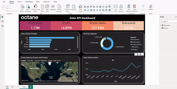
Within the Power BI ecosystem, Power View is the go-to tool for creating interactive and visually appealing reports and dashboards. It helps users transform data into insights that are not only informative but also captivating.
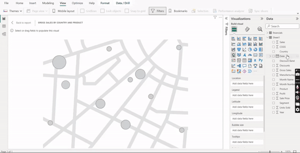
Power Map

For spatial and geographical data visualization, Power Map comes to the rescue. This 3D mapping tool allows users to explore and interact with data in a spatial context, providing a new dimension to data analysis.

Power BI Embedded

Power BI Embedded extends the reach of Power BI by allowing developers to embed reports and dashboards into custom applications, websites, or portals. This feature ensures that users can seamlessly access data visualizations within the applications they already use.

Power BI Premium

For organizations with larger data needs and a thirst for advanced features, Power BI Premium delivers. It provides dedicated capacity for data processing, enhances data security, and allows for the sharing of reports with a broader audience without the need for individual licenses.

Choosing the Right Power BI Plan

When it comes to choosing the right Power BI plan for your organization, you have three primary options: Power BI Free, Power BI Pro, and Power BI Premium. Each plan offers distinct features and capabilities, allowing you to tailor your solution to your specific requirements.

1. Power BI Free

Best for: Small-scale, individual use with limited sharing and collaboration needs.

Power BI Free is the entry-level option, providing a taste of the tool's capabilities at no cost. It's perfect for solo entrepreneurs, startups, or anyone looking to explore Power BI's capabilities without a financial commitment. With Power BI Free, you can connect to various data sources, create basic reports and dashboards, and even share them with others.

2. Power BI Pro

Best for: Teams and organizations that require more sharing and collaboration features, as well as scheduled data refresh.

Power BI Pro takes collaboration to the next level. It's designed for teams, departments, and organizations where data sharing and collaboration are crucial. With Power BI Pro, you can publish reports to the Power BI service, share them with colleagues, and even collaborate on reports in real-time. Scheduled data refresh ensures that your data is always up to date.

3. Power BI Premium

Best for: Larger enterprises that require dedicated capacity, extensive sharing options, and advanced features.

Power BI Premium is the choice for organizations with more extensive data analytics and reporting needs. It offers dedicated capacity, meaning faster performance and more reliable service. With Power BI Premium, you can share reports with external users, distribute content to a broader audience, and take advantage of advanced features like paginated reports and AI capabilities.

Making the Right Choice

The choice of the right Power BI plan depends on various factors, including your organization's size, budget, and specific requirements for data analytics and reporting. Smaller businesses and individuals may find Power BI Free or Power BI Pro more than sufficient, while larger enterprises often opt for the robust capabilities of Power BI Premium.

In summary, Power BI is a versatile tool that can cater to the needs of organizations of all sizes. Whether you're just starting your data analytics journey or looking to expand your existing capabilities, there's a Power BI plan that's just right for you. By selecting the plan that aligns with your unique needs, you can unlock the full potential of your data and drive informed decision-making within your organization. So, go ahead, harness the power of Power BI, and transform your data into actionable insights.


Line

6 Reasons why you should get DataFusion - a TM1 connector

Mode_Comment_Icon_black0
Alarm_Icon_13 min

DataFusion is a TM1 connector developed by Octane. It was borne out of the frustration clients were facing extracting data out of their IBM Planning Analytics application into other enterprise Reporting tools like Power BI, Tableau and Qlik. Typically this was set up as a manual task that required an IT or Finance person to drop a csv and upload into Reporting tools. This created a number of issues. Firstly it required the operator to ensure that the correct slab of data has been captured and uploaded. It also created a risk as end users would have to rely on operator to perform this task on as regular basis as required. This created a single person dependency and if he or she is on leave the data may not get refreshed as teams scramble to find out how to do this task.


The other issue with this approach was a lack of consistency. Being manual the end users would not have a clear idea of when the data from Planning analytics was uploaded. There also was a constant reconciliation issue as numbers would move in Planning Analytics TM1 and would not be reflected in the Reporting tools in a timely manner.


Enter Data Fusion – This is a Planning Analytics TM1 connector Octane has developed to solve this problem. This allows your Planning Analytics TM1 to connect to all major Reporting tools (Power BI, Tableau and Qlik). Datafusion comes with an easy to navigate admin portal to allow admin to set up the data block amongst frequency of data flow to reporting tools. End users can be given access to load data on an ad hoc basis if required. Datafusion uses TM1 security for data access.


Datafusion not only brings in the updated Data but also metadata so if you have a new element like a store/division or region in you Planning Analytics TM1 it will flow through to your reporting tool automatically.


  1. Data Accessibility

Quick and direct data accessibility from all major reporting tools. Ensure your reporting tools across enterprise are reporting on the most up to date data and everyone is using the same numbers for reporting

  1. Automation

Set up the connector once and it runs automatically. All processes are automated and requires no human intervention for scheduled runs.

  1. Efficiency

Reduces the turnaround time of the data refresh process by direct and automated process. Also eliminate all your reconciliation issues with varying numbers between Planning Analytics TM1 and your Power BI’s, Tableau and Qlik.

  1. User friendly design

Easy to use interface and quick setup. Fully supported by Octanes Support teams.

  1. Data Flexibility

Flexible enough to extract any new records with new elements built. Bring in data and metadata and have it displayed in your reports automatically

  1. Eliminate Data issue

There is zero manual handling of data and almost fool proof for your data reconciliations and traceability of data in your Reports.


If you are using Planning Analytics TM1 and taking data out using csv or any other manual method then you should contact us for a demo to see how DataFusion can automate this process for you.


Connect TM1 to Power BI


Got a question? Shoot!

Lorem ipsum dolor sit amet, consectetur adipiscing elit, sed do eiusmod tempor incididunt ut labore et dolore magna aliqua.

Get more articles like this delivered to your inbox