 0
0
 23 October 2024, 8:30:00 am AEDT
 5 min
5 min

 0
23 October 2024, 8:30:00 am AEDT
5 min
0
23 October 2024, 8:30:00 am AEDT
5 min

Planning Analytics Workspace (PAW) offers a robust suite of visualizations, enabling users to create rich and compelling reports and dashboards with remarkable flexibility. However, even with these capabilities, you may occasionally encounter requirements that push the limits of ...
Planning Analytics Workspace (PAW) offers a robust suite of visualizations, enabling users to create rich and compelling reports and dashboards with remarkable flexibility. However, even with these capabilities, you may occasionally encounter requirements that push the limits of what PAW provides out of the box.
One such scenario I encountered was the need to create a column chart comparing Actual vs Budget variance. The twist? Any negative variance should be highlighted with a red bar, while positive variance should be displayed in green, as shown below:
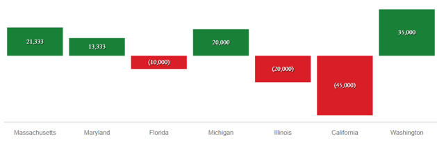
PAW’s default settings don't currently offer this kind of custom conditional formatting for visualizations. However, with a little MDX magic and a few formatting tweaks, you can achieve this effect in just five simple steps.
Step 1: Position the Version Dimension in the Column
Start by positioning the Version dimension in the column of the Exploration view. This is where we will apply the MDX logic to derive the desired results.
Step 2: Use MDX to Create Calculated Members
Next, you'll need to update the MDX query by creating three calculated members to represent Actual vs Budget (AvB), Positive Variance, and Negative Variance.
Here’s the MDX code:
MDX code:
WITH
MEMBER [Version].[Version].[AvB] AS [Version].[Version].[Actual] - [Version].[Version].[Budget]
MEMBER [Version].[Version].[Positive] AS IIF([Version].[Version].[AvB] > 0, [Version].[Version].[AvB], "")
MEMBER [Version].[Version].[Negative] AS IIF([Version].[Version].[AvB] < 0, [Version].[Version].[AvB], "")
Note: The AvB calculation could also be done using a consolidated member in the Version dimension, where the Budget has a negative weight.
Step 3: Replace the MDX in the Row Axes
Now, replace the MDX in the Row Axes relating to the Version dimension to show only the Positive and Negative calculated members, while excluding the AvB calculation (and any other member):
MDX code:
{
EXCEPT(
{
[Version].[Version].[AvB],
[Version].[Version].[Positive],
[Version].[Version].[Negative]
},
{
[Version].[Version].[AvB]
},
ALL
)
}
This MDX will generate a view that displays only Positive and Negative members in the Version dimension, leaving the non-relevant member (whether positive or negative) as blank, depending on the AvB value.
Step 4: Convert the Exploration View into a Column Chart
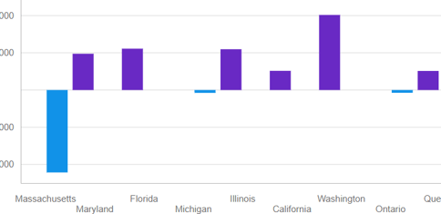
Once the MDX has been applied, convert the Exploration view into a Column Chart. By default, PAW will show the columns for positive and negative values with its standard color scheme.
Step 5: Apply a Custom Color Palette
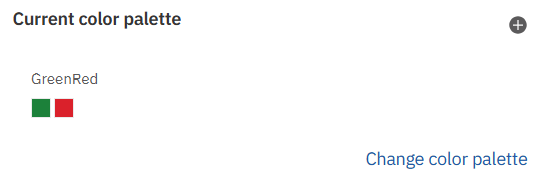
To finalize the visualization, we’ll apply a custom color palette. Navigate to the visualization properties and create a color palette that includes only two colors: green for positive values and red for negative values.
Conclusion
With just a few lines of MDX and a bit of customization, you can significantly enhance PAW visualizations. This technique allows you to move beyond the standard out-of-the-box options, giving you the flexibility to create more intuitive and visually effective reports. Whether you're comparing Actual vs Budget or any other metrics, these methods help you build visuals that not only convey the necessary information but do so in a way that is easy to interpret at a glance.
By leveraging MDX and PAW’s formatting tools, you can push the boundaries of your reporting and create dynamic, insightful dashboards tailored to your business needs.

Amin Mohammed is a Solutions Architect, Project Team Leader and a professional trainer with over 10 years of project design, implementation and project management experience. He has successfully led and delivered multiple offshore as well as onshore projects globally.
 print
print


Leave a comment